This was our first opportunity after almost four week with this brief to see where everyone was up to and receive some formal feedback. As a result i went armed with quite a lot of info. including a storyboard and maock up of the product, as per Design Practice blog. My group was with Amber and included
Will, Beth, Sophie, Luke and Dom.
My moving image idea was enthusiastically received and the group gave me some ideas on developing the packaging including possibly laser cutting a real vinyl single to hold the DVD. I really liked this concept however given I had not yet produced the moving image I was not sure if there would be time to try this one out.
Most of the group had carried out copious amounts of research but Beth for example got some useful feedback to develop her product in a way she had not thought of. Amber stressed to us all the imortance of thinking about our audience.
Luke's idea for using 100 books to convey the size of the universe was really interesting and we were all fascinated by the fact he had already made so many books!

Lisa Whitaker PPD
Saturday, 29 January 2011

Monday, 10 January 2011
Collection 100 -Presentation
This is the feedback I received from my group on the presentation about 100 vinyl album covers. Overall the feedback was positive, the consensus was that I had chosen and interesting subject and there were several ways I could now take the research.


Tuesday, 14 December 2010
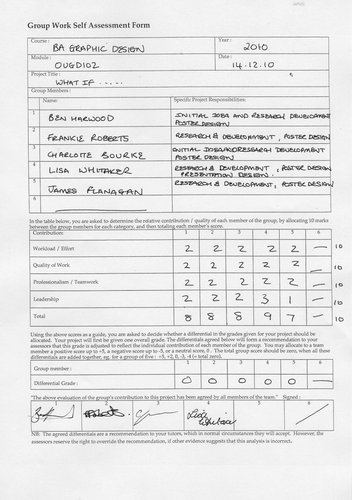
Self evaluation - What if...
The problem we identified from the original Collection 100 research was 'How do we make the people of Leeds aware of how much they are being watched?
The initial research was mainly from Ben and Charlotte as they had collected CCTV research for their collection 100. We had a collection of about 40 primary source photographs of CCTV camera in and around Leeds City Centre. As I had not touched on CCTV in my research I went back to the drawing board so to speak and also carried out some research. The evidence I collected included data about the number of cameras in Leeds, the cost of running CCTV to the public, newspaper articles supportive of CCTV. I also found Leeds Transport website also carries live images from transport CCTV in Leeds. Other primary evidence included the fact that camera were not at eye level and mostly placed at great height. Also a lot of cameras around Leeds are not identified and often disguised as lights.
Methods used to collect the research included -
Primary research- Qualitative - Photographs of live CCTV cameras
Survey of people's opinions of CCTV cameras
Quantitative - Counting the number of cameras on a Briggate.
Secondary research - Qualitative - Internet - Leeds Council website, council reports, Yorkshire Post which lead to links to Big Brother Watch. You Tube has a host of CCTV/Big Brother videos.
Quantitative - Internet - Council website - number of cameras, CCTV annual cost,
One of the most useful methods of research was just walking around Leeds observing the CCTV. This influenced my 'eye looking' up poster as unless you look up you do not notice the cameras at all. This also helped us negate the Pavement advertising idea as what is the point of trying to encourage people to look down when we really wanted them to look up!.
One You Tube video we watched also proved how strongly people feel about CCTV and in a way they were trying to raise awareness. The women in the video was 'holding' the poster and the whole thing immediately felt more personal and engaging. Ben and I both hooked into this idea which lead to the outcome.
Unfortunately with time constraints in the second week we were not able to carry out a primary quantitative survey of the public. The biggest learning point of the whole brief for me, rather than going out armed with a clipboard and pen to ask the public questions just take a camera and hold some engaging posters up. A large number of people stopped to look and some asked us what we were doing. Unfortunately there was only really time to record us in the street with the posters. With more time I would have liked to have formulated a simple question about CCTV to establish of one hundred people how many were aware of the cameras we identified.
Five things I have learnt about the design process over the last two weeks
Five things I would do different next time
1. Formulate a questionnaire for primary research early on so this can inform the outcome.
2. Be bolder with solutions, why not video instead of photographs?
3. We all produced posters to use on the hitting Briggate exercise. On reflection we would have made more impact if we had chosen one strong design from these to use for all the posters
4. As far as the starting point for Collection 100 Photos, after seeing he interesting images other people had produced I would try to think outside the obvious next time.
5.
The initial research was mainly from Ben and Charlotte as they had collected CCTV research for their collection 100. We had a collection of about 40 primary source photographs of CCTV camera in and around Leeds City Centre. As I had not touched on CCTV in my research I went back to the drawing board so to speak and also carried out some research. The evidence I collected included data about the number of cameras in Leeds, the cost of running CCTV to the public, newspaper articles supportive of CCTV. I also found Leeds Transport website also carries live images from transport CCTV in Leeds. Other primary evidence included the fact that camera were not at eye level and mostly placed at great height. Also a lot of cameras around Leeds are not identified and often disguised as lights.
Methods used to collect the research included -
Primary research- Qualitative - Photographs of live CCTV cameras
Survey of people's opinions of CCTV cameras
Walking around Leeds observing where cameras were located, how visible they were and what they looked like
Secondary research - Qualitative - Internet - Leeds Council website, council reports, Yorkshire Post which lead to links to Big Brother Watch. You Tube has a host of CCTV/Big Brother videos.
Quantitative - Internet - Council website - number of cameras, CCTV annual cost,
One of the most useful methods of research was just walking around Leeds observing the CCTV. This influenced my 'eye looking' up poster as unless you look up you do not notice the cameras at all. This also helped us negate the Pavement advertising idea as what is the point of trying to encourage people to look down when we really wanted them to look up!.
One You Tube video we watched also proved how strongly people feel about CCTV and in a way they were trying to raise awareness. The women in the video was 'holding' the poster and the whole thing immediately felt more personal and engaging. Ben and I both hooked into this idea which lead to the outcome.
Unfortunately with time constraints in the second week we were not able to carry out a primary quantitative survey of the public. The biggest learning point of the whole brief for me, rather than going out armed with a clipboard and pen to ask the public questions just take a camera and hold some engaging posters up. A large number of people stopped to look and some asked us what we were doing. Unfortunately there was only really time to record us in the street with the posters. With more time I would have liked to have formulated a simple question about CCTV to establish of one hundred people how many were aware of the cameras we identified.
Five things I have learnt about the design process over the last two weeks
- The importance of a team when evidencing work - You can't take photos and hold posters up.
- The importance of a team when there are several tasks to be carried out in a short space of time
- Having a wide range of different types of research informs both the identification of the problem and in turn the solution.
Five things I would do different next time
1. Formulate a questionnaire for primary research early on so this can inform the outcome.
2. Be bolder with solutions, why not video instead of photographs?
3. We all produced posters to use on the hitting Briggate exercise. On reflection we would have made more impact if we had chosen one strong design from these to use for all the posters
4. As far as the starting point for Collection 100 Photos, after seeing he interesting images other people had produced I would try to think outside the obvious next time.
5.
Monday, 22 November 2010
OUGD101 Design Principles Module self-evaluation
BA (Hons.) GRAPHIC DESIGN | LEVEL | 04 | |
Module Code | OUGD101 | ||
Module Title | DESIGN PRINCIPLES | ||
END OF MODULE SELF-EVALUATION |
NAME | Lisa Whitaker | BLOG. ADDRESS | http://l-whitaker1013.blogspot.com/ |
1. What skills have you developed through this module and how effectively do you think you have applied them? | |||||
· More aware of colour and the science underlying colour. Colour in terms of RGB for screen and CMYK for print. The Pantone library, colour swatches in Photoshop and Illustrator. · Font terminology, X-height, stroke, serif and san serif. Starting to think about which fonts communicate the message most effectively and why · Setting up and updating a Blog. I am managing to blog regularly however need to make more visual as still do a lot of writing to explain myself. · Illustrator skills – the pen tool, pathfinder and tracing. Applied this to creating my typeface Lewis and also the Illustrator brief reasonably well. · The crit groups are providing skills and confidence to look at work beyond just liking or disliking it. I can see the importance of this skill for the whole group to grow as designers. | |||||
2. What approaches to/methods of research have you developed and how have they informed your design development process? | |||||
Time constraints have led to a lot of the research being sourced online however the library, if difficult to navigate, has been useful. The library research tends to be more relevant and stronger in the design development process e.g. the Yann Legendre posters from the Graphic Posters annual 08/09 in the No News brief. Websites like D&AD and Behance are useful for inspiration and also often provided paths to other research, which otherwise may not have found. The No News research conducted from the Guardian article about underage drinking statistics also proved to be like the start of a huge web of information. This lead me to the viral advertising on underage drinking performed by comedian Bill Bailey. The hard-hitting messages certainly were a reality check in terms of the audience and subject. Up to that point I felt to be taking the moral high ground. | |||||
3. What strengths can you identify in your work and how have/will you capitalise on these? | |||||
The main strength in my work has been pinning down an idea/concept quite early on. For example I was pleased with the pint glass/straw imagery in the No news – interpretation. On the No news- delivery brief, the ‘wrap your kids in bubble wrap’ metaphor was also strong and relatively easy to translate visually. | |||||
4. What weaknesses can you identify in your work and how will you address these more fully? | |||||
The execution of the ideas into reality is sometimes frustrating in terms of my current software skills. Also due to time constraints I have tended to use Photoshop, which I am stronger in when Illustrator would have been a better tool. Whenever I come across a problem I usually search for a tutorial or ask one of the Mac suite instructors. For example I did not know how to get a dotted line around the teenager silhouette but Mike explained how to do this in Illustrator. I now have a better understanding of Vector images and rastorised images. The only problem with this approach is my skills are limited to grow in line with the demand of each brief. There is a huge black hole of software I am not utilising. I plan to try to get more to grips with Illustrator between now and January by speaking with Michael or Simon for the best approach. | |||||
5. Identify five things that you will do differently next time and what do you expect to gain from doing these? | |||||
1. Keep a more visual sketch book and /or design sheets – Design development more structured and more interesting to reflect on 2. Try to consider a broader range of solutions before selecting. Due to the tight deadlines I tend to go with the first idea. The outcome can only be stronger by considering more solutions early on. 3. Think beyond Photoshop. More varied solutions 4. Have the confidence to think beyond software and go back to drawing/painting to get a more hand crafted solution. 5. Keep up with the background reading including Graphic design journals such as Creative Review. Keep my work current and informed. | |||||
6.How would you grade yourself on the following areas: (please indicate using an ‘x’) 5= excellent, 4 = very good, 3 = good, 2 = average, 1 = poor | |||||
1 | 2 | 3 | 4 | 5 | |
Attendance | X | ||||
Punctuality | X | ||||
Motivation | X | ||||
Commitment | X | ||||
Quantity of work produced | X | ||||
Quality of work produced | X | ||||
Contribution to the group | X | ||||
The evaluation of your work is an important part of the assessment criteria and represent s a percentage of the overall grade. It is essential that you give yourself enough time to complete your written evaluation fully and with appropriate depth and level of self-reflection. If you have any questions relating to the self evaluation process speak to a member of staff as soon as possible. | |||||
Sunday, 21 November 2010
No news - Message & deliver self- evaluation
What is being communicated , how and to which audience?
The mail shot is aimed at parents of boys aged 10 to 15. The message communicated is three fold it raises awareness of the shocking statistic that under 18's consume 11.4 pints per second and then goes on to address what can be done about this. The fact that parents need to talk to their children and then directs them to a website for help.
How well do you think you have answered the brief.
I am pleased that I kept the message clear and focused. The main reason I think the brief is well answered is because I have clearly identified the target audience and also considered a practical and achievable method of addressing this worrying statistic. Practically I kept within the constraints of the brief which were the size, two colours plus stockand also delivered a solution which was sucessfully mailed and received.
The strengths of the resolution
Engaging - the bubble wrap and metaphor' wrapping you kids in bubble wrap'
Two mails shot can be printed on one sheet of A2 double sided paper (economical)
Clear directed solution to the problem.
How could it be improved?
Could be changed to be directed to parents of girls by changing silhouette to a girl.
The message/facts could be simplified further.
Experiment with different stock to find best weight/finish
Conclusion
This subject was really engaging and interesting ( having two sons) so I did extensive research both about the article and then around the whole subject. The colour yellow came from an initial idea linked to liver disease which I actually dropped. Generally this effects people later in life so is a difficult concept for parents/children to relate to. The yellow stuck as I decided this is a good warning color. The black came from the silhouette. I was able to find lots of interesting facts and advise however decided the strongest fact was that the best educators for children is their parents.
The mail shot is aimed at parents of boys aged 10 to 15. The message communicated is three fold it raises awareness of the shocking statistic that under 18's consume 11.4 pints per second and then goes on to address what can be done about this. The fact that parents need to talk to their children and then directs them to a website for help.
How well do you think you have answered the brief.
I am pleased that I kept the message clear and focused. The main reason I think the brief is well answered is because I have clearly identified the target audience and also considered a practical and achievable method of addressing this worrying statistic. Practically I kept within the constraints of the brief which were the size, two colours plus stockand also delivered a solution which was sucessfully mailed and received.
The strengths of the resolution
Engaging - the bubble wrap and metaphor' wrapping you kids in bubble wrap'
Two mails shot can be printed on one sheet of A2 double sided paper (economical)
Clear directed solution to the problem.
How could it be improved?
Could be changed to be directed to parents of girls by changing silhouette to a girl.
The message/facts could be simplified further.
Experiment with different stock to find best weight/finish
Conclusion
This subject was really engaging and interesting ( having two sons) so I did extensive research both about the article and then around the whole subject. The colour yellow came from an initial idea linked to liver disease which I actually dropped. Generally this effects people later in life so is a difficult concept for parents/children to relate to. The yellow stuck as I decided this is a good warning color. The black came from the silhouette. I was able to find lots of interesting facts and advise however decided the strongest fact was that the best educators for children is their parents.
Subscribe to:
Posts (Atom)