Monday, 23 April 2012

OUGD204 Design -Communication through type


Before I embarked on the degree program two years ago my knowledge of typography and layout was limited to my life experience and one month of a level two art and design course. To say I felt like a fish out of water in the workshops was an understatement however I embraced the sessions and did push myself.  

Over the last few months my typography skills have grown in part as the workshops have reinforced the importance of attention to detail. For example widows, breaking sentences, column widths and gutters.  Also thinking about text being a person actually speaking and so how this is read through choice of font, weight, and point size. I also appreciate how and when to use leading and kerning.

All the Graphic Design modules consider audience however this module has made me think about readability of text and making the block of text as inviting to read as possible.

The investigation and research around Typography has  made me realise that you don’t necessarily need colour or image to communicate successfully.  Considering what subtle messages a typeface selection alone conveys can be enough. A solid understanding of the history and development of type is essential in order to execute this successfully.  

I am disappointed that I was not able to apply more time to the Type Journal; however the work I have done has provided a solid foundation to continue developing my typography skills from now on.

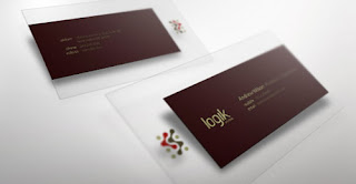
This module has developed real practical skills such as the design of a letterhead and business card.  I now have more confidence in my design skills and am looking forward  to putting these skills into practice.   

Thank-you Graham

Wednesday, 18 April 2012

Further development/ideas for Logo and Business Card

After a discussion with Jane and also looking at Domain names I decided to go with the Two Strings Design idea.  I also check Companies House and there are no other Companies registered with this name.  I have bought the Domain name.


I like the LW as below however as soon as I search LW Designs another company comes up.   If nothing else Two Strings creates a question/discussion thread on meeting people.


I looked at a Pantone Swatch book as the colours were printing out with more blue than green.  This is the colour I chose a a Process coated colour:  

DS-238-3C
DS-56-1c


I quite like the Orange contrast with the green/blue and it adds to the communication of 'two.'


Monday, 12 March 2012

Task 5 Ideas for a business card

Letter Gothic is a monospaced sans-serif typeface. It was created between 1956 and 1962 by Roger Roberson for IBM in their Lexington plant. It was initially intended to be used in Selectric electric typewriters. It is readable and is recommended for technical documentation and for sheets including columnar data. Gayaneh Bagdasaryan designed a proportional font called New Letter Gothic, based on Letter Gothic, for ParaType.
Letter Gothic was included in Windows 95. It was replaced by Andalé Mono in Windows 98 and in 2001, Windows XP replaced it with Lucida Console.


I want to find a font that feels reflective of me...I am not sure whether to find an 'analytical' looking typeface or a more creative looking one.


Luke inadvertently gave me an idea whilst having a joke at Joe's expense... hopwe Joe does not mind me 'borrowing' his idea...  Its a different typeface and looks squarer than what Joe has produced.


Inspiration for a decent Business Card

18-smokin-hot-business-card-designs


Sunday, 11 March 2012

Ideas for branding 'me'

Two for one


Buy one get one free


Sounds Too cheap/bargain like?


Two tone


http://www.twotone.co.uk/


Duo tone


 http://duotone2.com/
http://www.duodesign.co.nz/
http://duotonecreative.com/Index/Home.html


The Duotone Designer?


> Design


http://greaterthandesigns.com/GTD/Home.html


two in one


http://2in1design.com/


two over one


http://www.imageco.com/industry/accounting-graphic-design.htm


2fold design
http://www.2folddesign.co.uk/Blank.html


Double Design
http://www.doublesdesign.com/

Thursday, 8 March 2012

Creative CV content

Five Facts


1. ACMA qualified accountant
2. Names
3. Date of birth
4. Qualifications/ BAGD
5  Contact details


Five Practical Skills


1. Exhaustive research and investigative skills- Concept developer
2. Project Management and meeting dead lines
3. Analytical
4. Detailed knowledge
5.


Five Creative Skills
1.  Creative user of Adobe Illustrator, Photoshop, Indesign and After Effects
2.  Storyboarding for moving image
3.  Knowledge of printbased outcomes
4.
5.


Five personal qualities
1.  Team Manager of Slaithwaite Amateur Rugby league - An organiser
2.  Positive 
3.  Tenacity
4.  Supportive team player


Five Statements


An analytical designer with twenty years experience meeting deadlines and project managing as an Accountant.


A mature student on the prestigious Leeds College of ARt Graphic design degree.  Seeking a creative career after tenty years as a management accountant.


A Management Accountant who is now applying her problem solving and project management skills to the Creative Industry on the prestigious Leeds College of ARt Graphic Design degree

Tuesday, 6 March 2012

PPD workshop

Industrial Experience v Professional Research


In groups we discussed Industrial Experience V professional research


Industrial Experience(Negotiated)Professional research('you'drive)


Studio Visits                             Studio Visits
Portfolio surgery                      Visiting prof talks and lecture
Live Briefs                               Enterprise Brief
Enterprise brief (live events)     Interview agencies/others
Collaborative practice              Joining Media groups
Professional Interview              Tweet/Linkedin/Creative networks 
Freelance work                        Joining mailing lists
Self promotion                         Subscribing to blogs
                                              Network events/ Exhibitions